“Simple can be harder than complex. You have to work hard to get your thinking clean to make it simple. But it’s worth it in the end, because once you get there, you can move mountains.” — Steve Jobs, Apple, Inc.

Design
Edit, Edit, Edit!
Simple Design Is Great Design
When I hold an Apple TV remote next to a standard cable remote, when I see the Nike Swoosh on a billboard, or shop Uniqlo apparel, buy Method dish soap, bite into an RXBar — that’s when I see it. I see the driving force of great design.
Great design is simple. It is smart. It is sophisticated. For businesses to make their communication simple, they must make tough choices. It’s much easier to keep more, say more, promise more, or add more. It’s much harder to do the opposite- to edit. As a leader in design, I’m often asked what delivers strong creative execution? How do you know when you’ve landed at the perfect design solution? My answer, “When there is nothing left to take away. When you’ve boiled the idea down to its purest expression.” This does not mean making something sterile, it means making choices about what you need and what you don’t. Iconic design is memorable and stands for something. Not a million different things, but one important thing.
Great design is simple. It is smart. It is sophisticated. For businesses to make their communication simple, they must make tough choices. It’s much easier to keep more, say more, promise more, or add more. It’s much harder to do the opposite- to edit. As a leader in design, I’m often asked what delivers strong creative execution? How do you know when you’ve landed at the perfect design solution? My answer, “When there is nothing left to take away. When you’ve boiled the idea down to its purest expression.” This does not mean making something sterile, it means making choices about what you need and what you don’t. Iconic design is memorable and stands for something. Not a million different things, but one important thing.
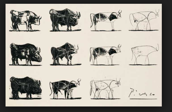
Pablo Picasso, The Bull Series, 1945
Picasso proves this truth. In fact, this famous artist’s philosophy influenced Apple and Steve Jobs. Just like Picasso, the Apple design process cycles through iterations of an idea. Editing, editing, editing, until the idea, product or innovation is delivered in the most concise way. Picasso describes this approach as abstraction. Take his well-known Bull series, for example. He began with a realistic image of a bull, then focused on the structure and shapes defining the bull’s form. As he experimented with these forms, he realized they could be reduced to simple outlines. Even then, he saw ways to eliminate most of the lines to leave a pure, singular outline that conveyed the essence of “bullness.” It’s beautiful and more intriguing than the real image. You immediately know what you are looking at by the implied outline. This type of aesthetic is what makes revolutionary design. It explains how Apple disrupted an industry to change the experience of personal computing forever, and why Method Soap was able to redefine an entire category though decor-worthy design.
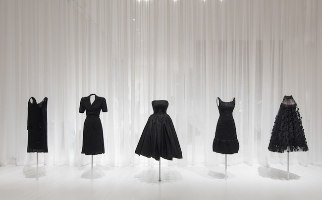
I think the most important part of design thinking is editing. It’s challenging to converge on the best solution after a broad proliferation of ideas. The test and learn step naturally helps simplify, in the same way Picasso used abstraction. I can’t begin to count the number of times I’ve sat in consumer focus groups listening to people complain about the complexity at shelf and the headache of finding the right product. The internet and e-commerce aren’t any better. Our social platforms and email inboxes are flooded with content. We are overloaded with information everywhere we go. As designers, clarity is the most generous gift our solutions can offer. Consumers and customers fall in love with brands that can do this, the same way generations of people have fallen in love with Picasso’s art or Chanel’s iconic little black dress.
I think the most important part of design thinking is editing. It’s challenging to converge on the best solution after a broad proliferation of ideas. The test and learn step naturally helps simplify, in the same way Picasso used abstraction. I can’t begin to count the number of times I’ve sat in consumer focus groups listening to people complain about the complexity at shelf and the headache of finding the right product. The internet and e-commerce aren’t any better. Our social platforms and email inboxes are flooded with content. We are overloaded with information everywhere we go. As designers, clarity is the most generous gift our solutions can offer. Consumers and customers fall in love with brands that can do this, the same way generations of people have fallen in love with Picasso’s art or Chanel’s iconic little black dress.
Embracing Simple Design
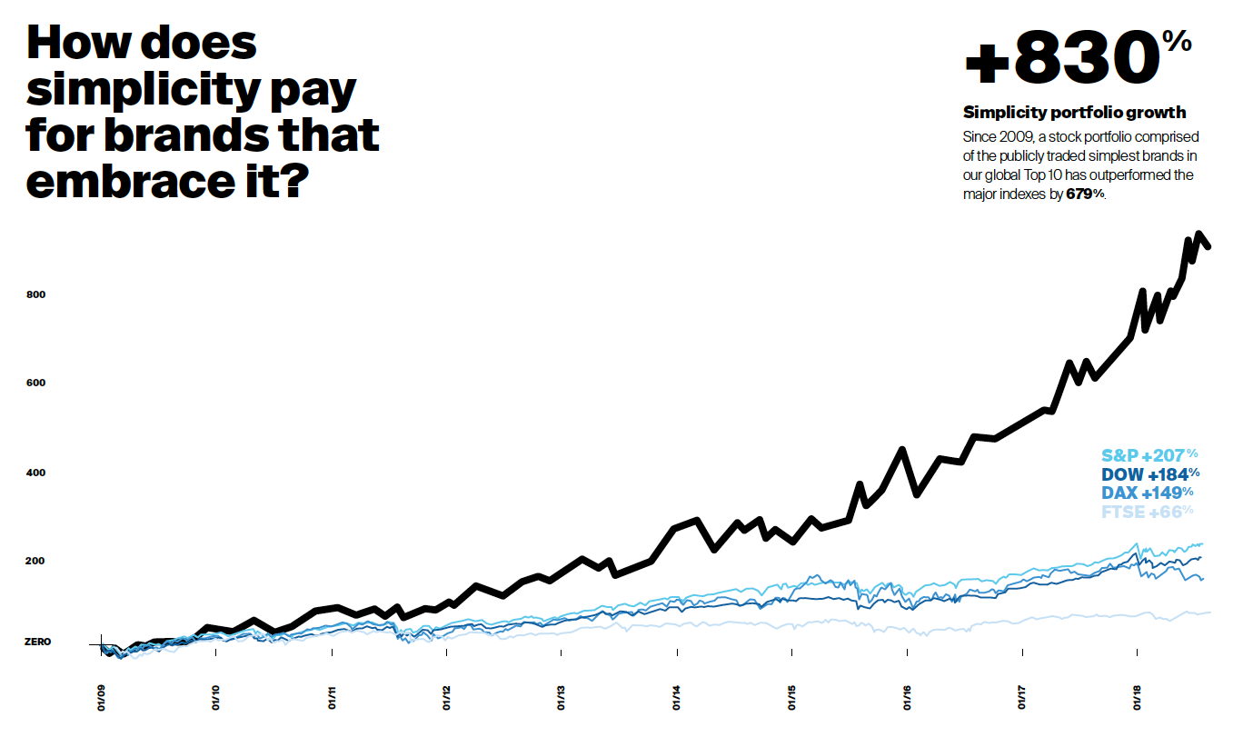
What can prove that simplicity pays off? According to Siegal+Gale’s global research with 15,000 consumers across nine countries, 8 years of findings reaffirm that simplicity inspires deeper trust, strengthens loyalty, and commands more premium pricing. “In the end, simplicity drives financial gain for brands willing to embrace it . . . since 2009, a stock portfolio comprised of the publicity traded simplest brands in our global Top 10 has outperformed the major indexes by 679%!”
If nothing else, I hope this has been a friendly reminder to edit. Whether you’re a designer, brand manager or marketer, ask yourself, what can I remove to make the consumer experience more intuitive? How can you prioritize to simplify — leaving only the most impactful elements, messaging or functions? Repeat that a few times. The result, I promise, will deliver extraordinary design, solutions that differentiate, and brands that captivate consumers.
Let’s create something
big together.
We love collaborating through challenges, big and small. If you're looking for a true partnership, we'd love to hear from you.
